What I Got - Progresswear
First off, I gotta apologize for the delay in this review for Progresswear. It got buried with the rest of the other reviews and I have personal stuff to attend to... my bad. So, with that out of the way...

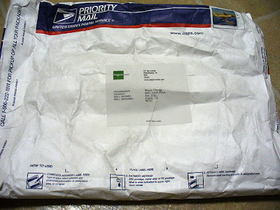
Here's the package I got.

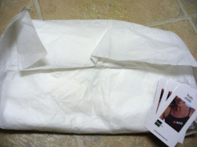
And here's what I have. I assume the layer of paper surrounding the t-shirt is meant to heighten the anticipation and not remind me about my trip at the butcher.
As I unwrapped the paper and looked at the t-shirt, I noticed something peculiar about the t-shirt.

This is what I got (the image is unadulterated)...

... and this is what is advertised on the website.
There's something dodgy about the image quality, no?
I talked to Patrick King (founder and designer of Progresswear) about the lackadaisical printing and he agreed. The printer he sent his t-shirts to weren't doing such a good job. King won't be using them again. There were also issues with the apparel the designs were printed on.

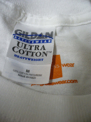
Currently for online sale, Gildan is the choice for printing, whereas for retail, it's American Apparel. I don't know about you but the two brands differ in sizes. It would have been nice if there were information on the website about the kind of apparel being used or a sizing chart. King is planning to use AA for the online sale in the future.
But in spite of the printing mishap, I really like Progresswear line-up, which isn't a surprise because King, is also a painter. He knows what's visually arresting. Take a look at one of his type t-shirt. At first glance, it looks like words on a shirt but there's something about the font, the spacing in between, the color used -- it's carefully constructed to attract the eyeballs to the message. For me, he really nailed it with the image of Pat Robertson, it's just crap luck that he landed with a crap printer.
I recommend this line-up... but I also recommend e-mailing King if you have any doubts about your purchase.

1 Comments:
Man, can I ever empathize with going to terrible printers... it's a really awful and frustrating experience!
Post a Comment
<< Home